We defined our target audience as GoPro owners and prosumer photographers through market research. Our primary interview subjects were Phantom owners. They helped us define feature parity and understand primary workflows. I rode along with filmmakers and videographers looking for opportunities reduce friction in the product experience.
Through this research we came to understand that it is really hard to get professional grade aerial video without being an expert pilot. It usually takes two people - one to pilot the vehicle and the other the direct and control the camera.
How can we enable amateur drone pilots to capture professional grade aerial video?
Requirements
Once we understood the goals of our users and some of their main pain points, we were able to start developing user stories as a means of imagining ideal user interactions.After that we used those scenarios to extract a core feature set and design requirements.
Through our research we discovered there were a few cinematic shots that were really common but really hard to get. So we developed what we called smart shots - which are semi-autonomous flight modes that let users focus on controlling the camera and not flying.


Once we felt we had a solid concept and a shot list, we had to figure out how the app should be structured, and how a user would actually initiate and execute one of the shots from the app.
I began by creating the architecture of the app so we could visualize all the components that needed to exist, and decide how they could be intuitively organized. I will focus on two primary sections of the app – the home page, and the video feed.

The home page served the purpose of general navigation through the app, connecting to the vehicle and managing preferences. It also gave us a space for connect instructions, system alerts, and marketing content.

The primary function of the video feed section was to give users FPV (first person view) of their flight. It also displayed telemetry information, allowed access to Smart Shots, and gave users ability to record to their phone, GoPro, or both.

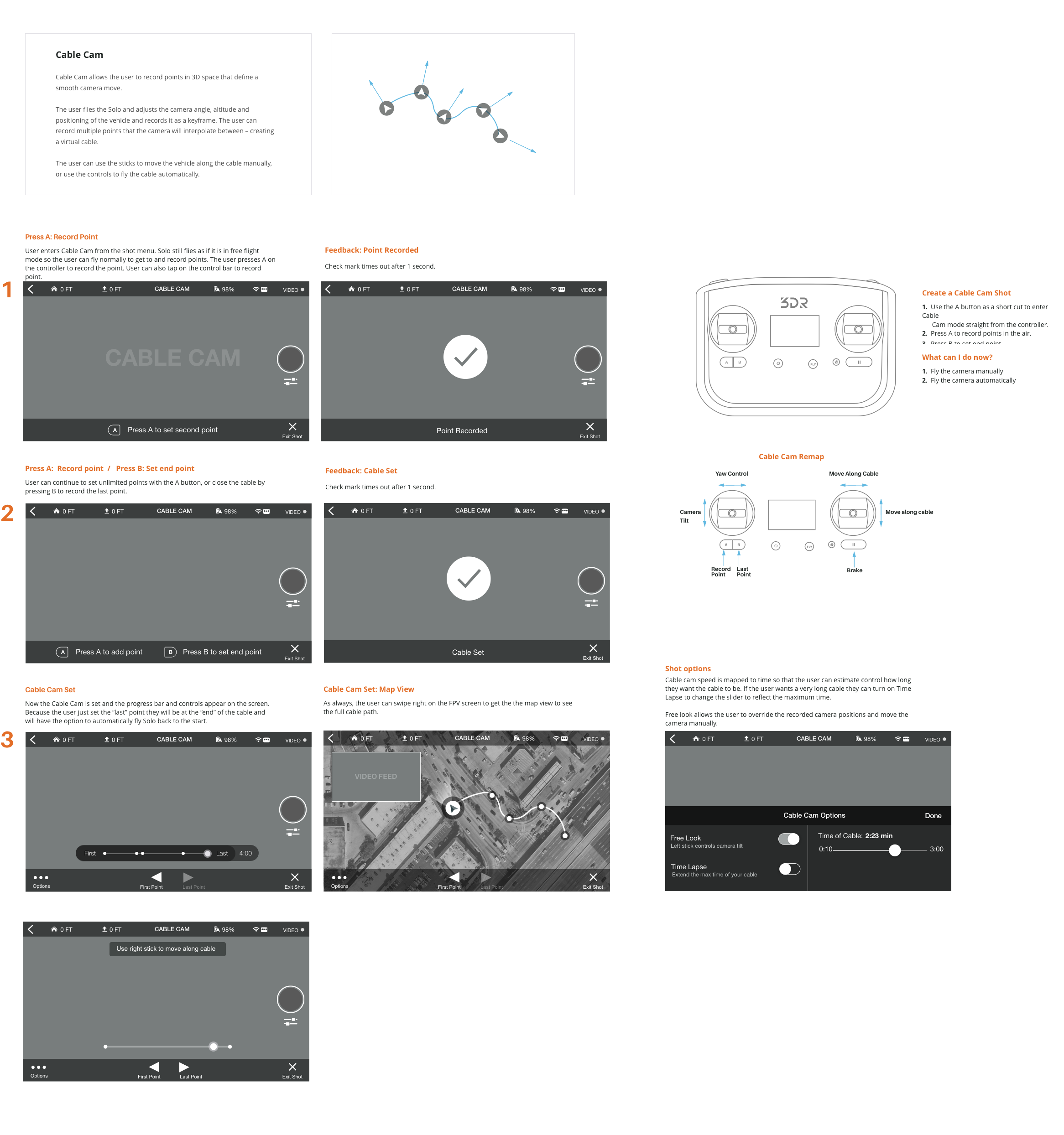
The Cable Cam shot lets a user record two points in the air and automatically move between those points on a virtual cable.
First the user flies to the first point, frames the shot and saves the point. Like setting a key frame in the air. Next the user flies to the second spot, frames the shot and records the point, creating a virtual cable.
When the cable is set, the user "plays" the shot and the drone automatically interpolates between the two points, relieving the user of having to fly and control the camera at the same time.

From Jason’s experience flying, he defined the idea of flying to a point in the air, framing the shot, and using the controller to record points (or create keyframes) to interpolate between. My main challenge was to define how a user would complete this task. I approached it as a task wizard interaction model where the user is guided through the setup with the bottom bar instructions. I wanted to reduce cognitive overload, so the user only has to focus on one thing at a time while setting up the shot.

The app was designed for both iOS and Android and had to look as similar as possible because of our limited design and support resources.
I chose a high contrast, saturated palette because the app would be used mainly outdoors and at a further distance when mounted on the controller.
I used bold graphics help users orient themselves more quickly when they are flying and glance down at the app.
I also wanted the UI to stand out of the way when the user was just flying and wanted to focus on the shot. I tried to make the UI as contextual and useful as possible.


